 What is without doubt the biggest information design project ever executed in the UK? The answer is all around us; it’s so familiar that we take it for granted, and yet it’s an essential part of everyday life.
It’s the signage system that adorns just about every road in the land. An iconic mix of pictograms and typography that forever changed the way we get around, and enabled instant navigation while driving at motorway speeds.
The challenge facing those responsible for coming up with Britain’s modern signage system is similar to that faced by infographics designers today: how do you get as much information as possible over using as few words and images as possible?
The story of how design duo Jock Kinneir and Margaret Calvert masterminded the elegant and highly efficient combination of lettering, colours, shapes and symbols used first for Britain’s motorways in the late 1950s and all other roads in the mid-1960s is brilliantly told by the Design Museum.
Kinneir said he started with the question: “What do I want to know, trying to read a sign at speed?” The pair devised the sans serif font now known as Transport and Calvert drew the pictograms in keeping with Transport’s curvaceous style. It’s Margaret Calvert we have to thank for the most familiar signs still in use today, such as:
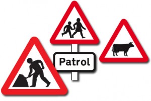
• Road works, though she admits it does look like a man having difficulties with an umbrella. “I just wish I’d left the tip on it to show it was shovel,” she says.
• School crossing – the girl in the pictogram is a self-portrait of her as a child.
• Cattle ahead – the image is based on a cow called Patience on a relative’s farm in Wiltshire.
Kinneir and Calvert went on to devise the Rail Alphabet typeface for British Rail as well as working on signage for numerous airports, hospitals and other public buildings.
What a legacy.


Leave a Reply